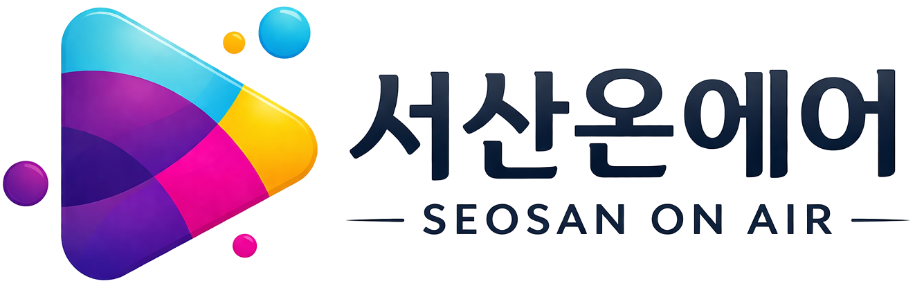
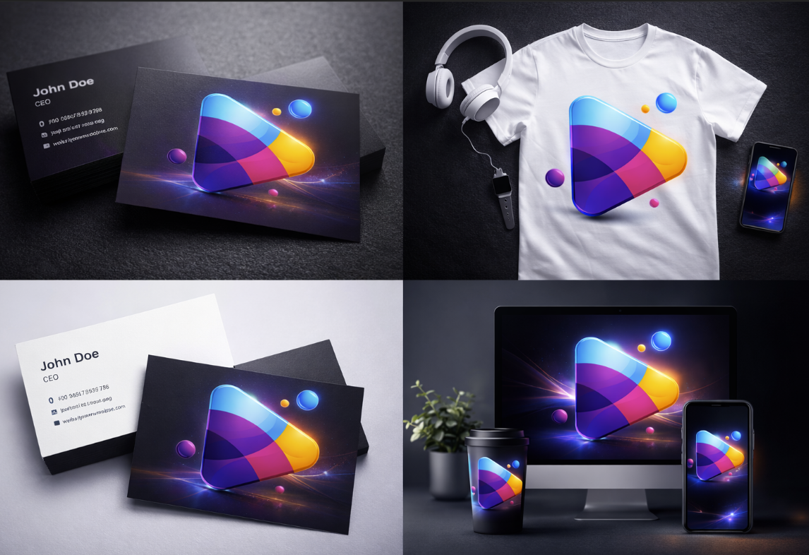
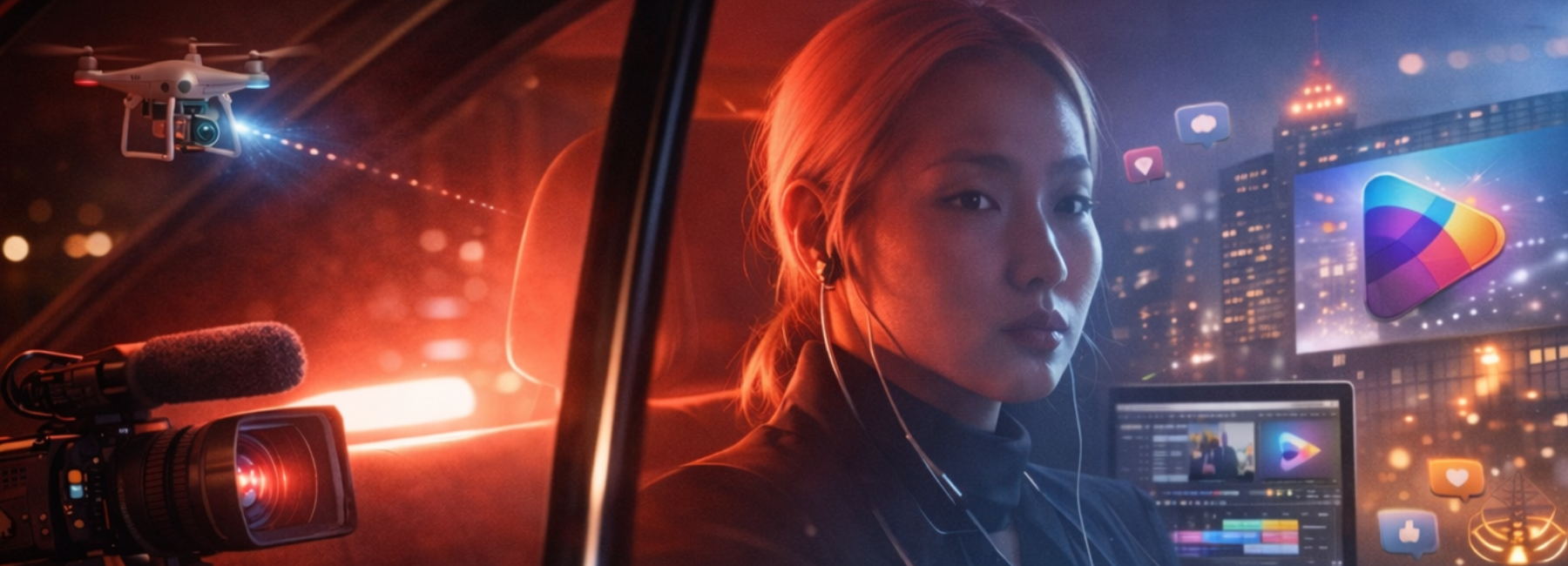
Seosan On Air Logo 서산온에어의 심볼은 콘텐츠의 시작, 연결, 확산을 상징합니다.영상과 디지털 미디어를 기반으로 고객의 메시지를 세상에 효과적으로 전달하는 서산온에어의 정체성을 하나의 형태 안에 담아낸 상징입니다. category: Design services: Ai Photography, Branding, Design Date: 2026-04-12 team: Seosan OnAir Team 콘텐츠로 연결하고, 가치로 확장하다 Color System서산온에어의 컬러 시스템은 신뢰와 기술, 창의성과 소통, 에너지와 확장성을 함께 담아내는 브랜드 언어입니다.각 컬러는 단순한 장식이 아니라 브랜드가 추구하는 가치와 역할을 시각적으로 전달하는 핵심 요소입니다.Primary ColorNavyHEX #142C63신뢰, 전문성, 안정감기업과 기관, 고객에게 신뢰를 주는 중심 컬러로, 서산온에어의 정제된 브랜드 이미지를 형성합니다.BlueHEX #25A9E0디지털, 기술, 확장성온라인 환경과 디지털 기술 기반의 서비스 역량을 상징하며, 미래지향적이고 역동적인 브랜드 이미지를 표현합니다.PurpleHEX #5A20C9창의성, 감각, 프리미엄차별화된 아이디어와 세련된 감성을 나타내며, 감각적인 콘텐츠 기업으로서의 정체성을 강화합니다.MagentaHEX #EC1E93소통, 주목성, 에너지메시지 전달력과 시각적 주목도를 높이는 포인트 컬러로, 브랜드의 생동감과 대중적 소통력을 보여줍니다.YellowHEX #F7C600아이디어, 활력, 긍정성새로운 발상과 밝은 에너지를 상징하며, 콘텐츠 기획 단계의 창의적 가능성을 표현합니다.OrangeHEX #F7931E확장, 추진력, 역동성브랜드가 시장과 고객을 향해 넓게 확장되는 힘과 실행력을 의미합니다.Color Principle서산온에어의 컬러는신뢰의 네이비, 기술의 블루, 창의의 퍼플, 소통의 마젠타, 에너지의 옐로와 오렌지를 통해브랜드의 전문성과 감각을 동시에 완성합니다. branding development digitalTwitterFacebookPinterestLinkedin